Choosing the right font for your website is crucial for a great user experience and strong brand identity. The font you select affects how visitors perceive your site, how easily they navigate through it, and how they engage with your content. In this blog, we’ll break down the best fonts for websites, their features, and how to pick the right one for your needs.
Why Fonts Matter
Before diving into the best fonts, it’s essential to understand why typography is so important:
- First Impressions: The font you choose is one of the first things visitors notice. A professional font can establish credibility,while a poorly chosen one can drive potential customers away.
- Readability: Good typography ensures that your content is easy to read, keeping visitors engaged and reducing bounce rates
- Brand Identity: Consistent and appropriate fonts help reinforce your brand’s identity, making it more recognizable and memorable.
Factors to Consider When Choosing a Font
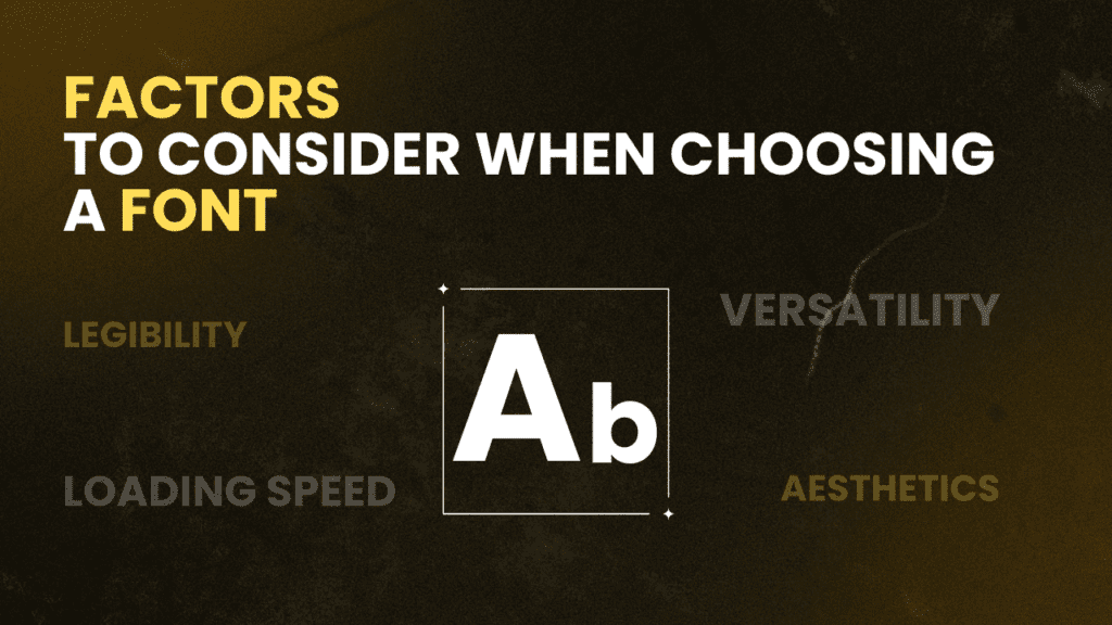
Legibility: Make sure the font is easy to read on all devices and screen sizes.
Versatility: The font should look good in different sizes and weights, from headlines to body text.
Aesthetics: Pick a font that matches your brand’s style.
Loading Speed: Web-safe fonts load faster, which helps your site perform better.
Top Fonts for Websites
Here are some of the best fonts for websites, categorized by their characteristics and use cases:
1 . Arial

Arial is known for its simple, clean lines, making it a popular choice for both body text and headings. Its readability at small sizes and high versatility make it a dependable option for various web applications.
2 . Helvetica
Helvetica is known for its neutral, clean, and professional appearance. It is commonly used in corporate and minimalist designs because of its excellent readability and versatility.
3 . Roboto

Roboto features modern, geometric shapes, and is frequently used in mobile app interfaces and modern websites. It is designed for digital screens, offering excellent readability.
4 . Open Sans
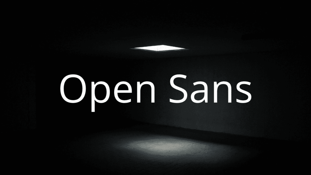
Open Sans has a neutral yet friendly look, perfect for modern websites. It is easy to read on all devices and also improves the user experience. Its versatility makes it suitable for various design needs, whether for headings or body text.
5 . Poppins
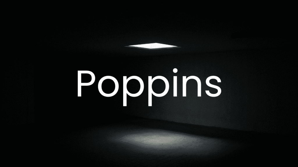
Poppins is geometric, modern, and stylish, suitable for trendy, modern websites and tech startups. It is highly legible and available in a wide range of weights and styles, making it versatile for various design needs.
6. Times New Roman
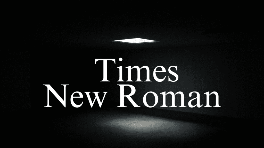
Times New Roman is characterized by its classic, formal appearance. It is suitable for websites that want to convey professionalism, offering high readability, especially in print.
7. Georgia
Georgia is elegant and traditional, perfect for blogs and articles. It is designed for on-screen reading and performs well at small sizes, making it a great choice for long-form content.
8. Lobster

Lobster is bold and cursive, ideal for logos and headings. It is attention-grabbing and has a unique style that can add personality to your website.
9. Playfair Display

Playfair Display is elegant and high-contrast, suitable for fashion, lifestyle, and luxury brands. It adds a touch of sophistication to any website, making it stand out.
10. Pacifico

Pacifico features a fun, cursive style, great for creative industries and casual brands. It creates a friendly and approachable feel, perfect for websites looking to convey warmth and creativity.
How to Choose the Right Font
- Understand Your Brand: Your font should reflect your brand’s personality. A tech startup might opt for a font like Roboto or Poppins, while a law firm might choose a font like Times New Roman.
- Consider Your Audience: Think about who will be reading your content. Younger audiences might appreciate modern, playful fonts, while older audiences might prefer more traditional, easy-to-read fonts.
- Test for Readability: Ensure your font is legible on all devices and screen sizes. Test it in different contexts, such as headings, body text, and buttons.
- Pair Fonts Wisely: If using more than one font, ensure they complement each other. A common approach is to use a serif font for headings and a sans-serif font for body text.
Conclusion
Selecting the best font for your website is about balancing how it looks, how easy it is to read, and how well it works for your needs. To choose the right font, consider your content, your brand’s style, and what your audience likes. A good font will make your website look great and keep visitors engaged, encouraging them to visit again.